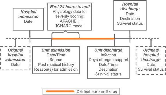
CMP Dataset (Version 3.1)
An overview of the Case Mix Programme (CMP) Dataset (Version 3.1) is provided below:
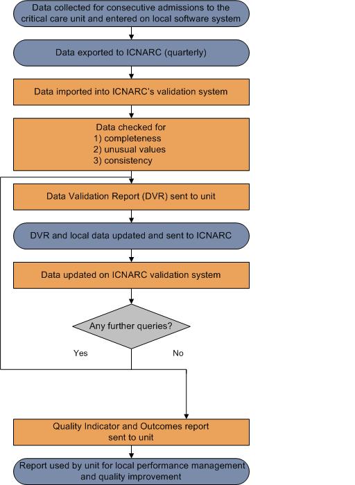
CMP data processing
An overview of the Case Mix Programme (CMP) process for the collection, entry, submission, validation, analysis and reporting of CMP data is shown in the diagram below:
Presentation of results
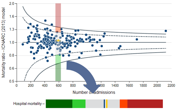
### Funnel plots
Potential quality indicators are presented in a funnel plot format.
The grey lines represent control limits at two standard deviations (2SD) represented by a dashed line, and three standard deviations (3SD) represented by a solid line. Selected units are highlighted in orange.
As the number of admissions increases, the precision with which a result can be calculated increases.
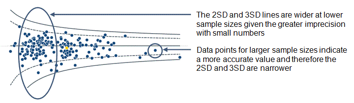
If variation between results is random then on average 95% of points should lie within the inner control limits (2SD) and 99.8% should lie within the outer control limits (3SD).
_For example – Risk-adjusted acute hospital mortality _
if the model is perfectly predicting Risk-adjusted acute hospital mortality, we expect the points to form a funnel shape centred on a mortality ratio of one (1.0).
### Delayed discharges (> 8-hour delay)
Please note the potential quality indicators relating to delayed discharges are not displayed as funnel plots. For these indicators, the dashed line indicates the 5% of critical care units with the highest rates.
### Quality indicator dashboard
The Quality indicator dashboard summarises the results of each quality indicator for a single NHS adult critical care unit. Note that the dashboard can only be viewed if a specific unit is selected from the drop-down menus at the top of the page, for all other selections (hospital, trust or network) nothing will be shown.
Each row of the dashboard can be viewed as a 'slice' through the corresponding funnel plot (see below) showing the unit's own value for that potential quality indicator relative to the comparator value and two and three standard deviation lines.
For _High risk sepsis admissions_, _Unit-acquired infections in blood_, _Out-of-hours discharges to the ward (not delayed)_, _Delayed discharges (> 8-hour delay)_, _Non-clinical transfers (out)_ and _Unplanned readmissions within 48 hours_, the comparator value is the mid line (i.e. the overall percentage/rate in all critical care units in the CMP for the time period of the report).
For _Risk-adjusted acute hospital mortality_ and _Risk-adjusted acute hospital mortality - predicted risk < 20%_, the comparator value is one (1.0), corresponding to observed acute hospital mortality equal to that expected from the ICNARC~_H_-2015~ model.
If the unit's value (orange line) falls within the light green or dark green regions of the dashboard, this corresponds to a value below the lower two standard deviation or three standard deviation lines of the funnel plot, respectively.
If the unit's value falls within the yellow or red regions, this corresponds to a value above the upper two standard deviation or three standard deviation lines, respectively.
Note that in some cases (particularly for small sample sizes or where an indicator exhibits a large amount of variation across critical care units), the green and/or yellow/red regions may not be present.
ICNARC risk prediction model
ICNARC uses the ICNARC~_H_-2015~ risk prediction model to calculate the risk of acute hospital mortality.
The ICNARC model was originally published in 2007.^1^ It was the culmination of many years of work to establish the best risk prediction model for use in the Case Mix Programme. Although the ICNARC model has been demonstrated to have better performance among patients admitted to UK critical care units than other risk models, ongoing improvement work is essential to further improve accuracy.
In developing the new ICNARC model, we addressed further areas for improvement, including handling of missing data, continuous nonlinear modelling of physiological predictors and making better use of available data from the hierarchical coding of reasons for admission to the critical care unit. We continue to seek improvements to this model to ensure that the risk predictions in all of ICNARC’s reports are as accurate as possible. The new ICNARC model was published in 2015 as the ICNARC~_H_-2014~ model,^2^ and has subsequently been recalibrated as the ICNARC~_H_-2015~ model using data for 134,063 admissions to 238 critical care units between 1 April 2013 and 31 March 2014.
For more information on the ICNARC risk prediction model including inclusion and exclusion criteria, please follow the link below:
[ICNARC risk prediction model](https://www.icnarc.org/DataServices/Attachments/Download/3b979280-4fc4-e511-b9a5-d48564544b14)
### References
1. Harrison DA, Parry GJ, Carpenter JR, Short A, Rowan K. A new risk prediction model for critical care: the Intensive Care National Audit & Research Centre (ICNARC) model. _Crit Care Med_ 2007; 35:1091–8.
1. Harrison DA, Ferrando Vivas P, Shahin J, Rowan KM. Ensuring comparisons of health-care providers are fair: development and validation of risk prediction models for critically ill patients. _Health Serv Deliv Res_ 2015; 3(41).
Managing outliers
An outlier is a result that is statistically significantly further from the expected comparator value than would usually occur by chance alone.
ICNARC have developed guidance to ensure that potential outliers are identified through the processes of national clinical audit. The guidance document sets out the actions that ICNARC takes when data indicate that results for a site significantly deviate from the expected value.
ICNARC's guidance on the detection and management of outliers is based on Department of Health recommendations on the 'Detection and management of outliers' and supersedes ICNARC’s previous policy.
For more information on the detection and management of outliers, please follow the link below:
Detection and management of outliers - guidance ([Click here to download](https://www.icnarc.org/DataServices/Attachments/Download/018b4e40-10cc-e511-b9a5-d48564544b14))
Statistical appendix
### Model fit
The current ICNARC risk prediction model was developed in 2014.^1^ It was recalibrated in 2015 using data from 134,063 admissions to 238 UK adult critical care units from April 2013 to March 2014.
For the purpose of the Case Mix Programme Annual Quality Report 2015/16, the fit of the model was assessed based on 187,057 admissions to 248 UK adult critical care units using the following methods:
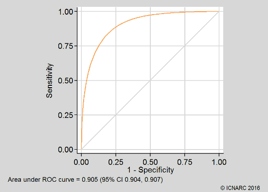
- Discrimination was assessed using the c index,^2^ equivalent to the area under the receiver operating characteristic (ROC) curve^3^;
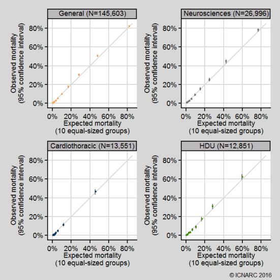
- Calibration was assessed graphically by dividing the dataset into 10 equal-sized groups based on quantiles of predicted risk (note that the Hosmer-Lemeshow test for perfect calibration was not used, as in a sample of this size, statistically significant departures from perfect calibration would be expected even with a well-fitting model^4^);
- Overall goodness of fit was assessed with Brier’s score, representing the mean squared error between outcomes and predictions.^5^
The c index (area under the ROC curve) was 0.905 (95% confidence interval 0.904 to 0.907). Calibration was qualitatively very good (see below). Brier’s score was 0.088. These compare favourably with values of the c index and Brier’s score 0.891 and 0.103 from the original development data and 0.885 and 0.108 from previous external validation.^1^ The ROC curve and calibration plot are shown below:

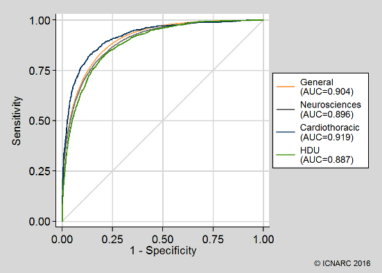
Discrimination and calibration were also assessed across different types of critical care units (general ICUs or ICU/HDUs; neurosciences critical care units; cardiothoracic critical care units; and standalone HDUs). The model performance was good across all unit types:
### Calculation of funnel plots
Funnel plots were calculated using the methods of Spiegelhalter (2005).^6^ Over-dispersion was adjusted for by estimating a multiplicative over-dispersion factor for each quality indicator based on 10% Winsorisation.^6,7^ The estimated over-dispersion factors were: High risk sepsis admissions, 1.31; Unit-acquired infections in blood, 3.02; Out-of-hours discharges to the ward (not delayed), 5.77; Non-clinical transfers (out), 3.17; Unplanned readmissions within 48 hours, 1.00 (no significant over-dispersion); Risk-adjusted acute hospital mortality, 1.55; Risk-adjusted acute hospital mortality – predicted risk < 20%, 1.53.
### References
1. Harrison DA, Ferrando-Vivas P, Shahin J, Rowan KM. Ensuring comparisons of health-care providers are fair: development and validation of risk prediction models for critically ill patients. _Health Serv Deliv Res_ 2015; 3(41).
1. Harrell FE, Califf RM, Pryor DB, et al. Evaluating the yield of medical tests. _JAMA_ 1982; 247:2543-6.
1. Hanley JA, McNeil BJ. The meaning and use of the area under the receiver operating characteristics (ROC) curve. _Radiology_ 1982; 143:29-36.
1. Kramer AA, Zimmerman JE. Assessing the calibration of mortality benchmarks in critical care: the Hosmer-Lemeshow test revisited. _Crit Care Med_ 2007; 35:2052-6.
1. Brier GW. Verification of forecasts expressed in terms of probability. _Monthly Weather Review_ 1950; 75:1-3.
1. Spiegelhalter D. Funnel plots for comparing institutional performance. _Stat Med_ 2005; 24:1185-202.
1. Spiegelhalter D. Handling over-dispersion of performance indicators. _Qual Saf Health Care_ 2005; 14:347-51.